In my 20% time at work, I’ve been writing a Python library for generating charts using Google’s Chart API. It is called graphy, and is now available as open source software on code.google.com.
I’ve frequently wanted to visualize data for various projects I’m working on but have been frustrated because the tools I’ve used are too heavyweight for making simple charts. When the opportunity came up to use the Google Chart API, I jumped at the chance to make a chart library I would enjoy using. The basic philosophy of graphy is to let you present your data naturally and then get out of your way.
I’ll give a couple examples of how it is used. If you’re interested, there are more examples in the user guide and in the source code. First, a simple bar chart showing how population has changed over the past 4 decades in three bay area cities:
from graphy.backends import google_chart_api

cities = ('San Jose', 'San Francisco', 'Oakland')
pop_1960 = (200000, 740000, 370000)
pop_2000 = (900000, 780000, 400000)

chart = google_chart_api.BarChart()
chart.AddBars(pop_1960, label='1960', color='ccccff')
chart.AddBars(pop_2000, label='2000', color='0000aa')
chart.vertical = False
chart.left.labels = cities
chart.bottom.min = 0
print chart.display.Img(300, 180)
That snippet gives this chart:

Next an example using a line chart to compare average temperature trends in two US cities:
from graphy.backends import google_chart_api
from graphy import formatters
from graphy import line_chart

# Average monthly temperature
sunnyvale = \
    [49, 52, 55, 58, 62, 66, 68, 68, 66, 61, 54, 48, 49]
chicago = \
    [25, 31, 39, 50, 60, 70, 75, 74, 66, 55, 42, 30, 25]

chart = google_chart_api.LineChart()
chart.AddLine(sunnyvale, label='Sunnyvale')
chart.AddLine(chicago, label='Chicago',
    pattern=line_chart.LineStyle.DASHED)
chart.bottom.labels = ['Jan', 'Apr', 'Jul', 'Sep', 'Jan']

chart.left.min = 0
chart.left.max = 80
chart.left.labels = [10, 32, 50, 70]
chart.left.label_positions = [10, 32, 50, 70]
chart.AddFormatter(formatters.InlineLegend)
print chart.display.Img(350, 170)
Here’s the resulting chart:

Check out the graphy project page for more information, including the full user guide and source code for graphy 1.0, released under the Apache 2 license.
This post is about being productive. It is also about drawing charts, Google App Engine, and monkeys. But mostly about being productive.
For a couple years now I’ve been running a project night. Once a week, myself and a few friends get together to work on whatever projects we’re currently involved with. The goal is to sit down and get stuff done, in the company of other productive people.
Last week, a friend and I decided to collaborate on a service for recording and charting measurements. The basic problem we’d be solving: “I want to measure some property X every N seconds and then draw a chart of the data.” The service would take care of aggregating the data and drawing charts. The user of the service would just have to write a client to periodically report measurements.
We set ourselves a challenge: try to finish a (very) rough end-to-end prototype in 2.5 hours. It would have a simple API for reporting new data points, a web page where you could view the charts, and one example client. Here’s what we managed to get done:
The whole things is done using Django on Google App Engine. There’s a simple REST API for posting new measurements, and a simple web interface for viewing the charts (which are drawn using Google Chart API).
Some observations from the project:
Picking a name is hard. Unless you’re in a hurry, in which case it becomes easy: you just pick the first name someone shouts out that isn’t taken. Stats Monkey was the first name that passed this test for us.
Having two people sitting next to each other made it much easier to stay in scope. When one of us was about to waste time over-doing something or going off on a tangent, the other one would step in. I don’t think we would have finished the project if we hadn’t been sitting next to each other announcing what we were about to do.
We both already had a lot of experience with all the tools we were using. This really helped, because there was basically no setup time. Google Code and App Engine both have really low startup costs for a project like this. I think maybe only 10-15 minutes were spent getting a subversion repository and hosting.
We hit a lot of SVN conflicts. We also had trouble with incomplete syncs/commits because we were both used to p4 semantics (where a commit includes files from the entire workspace, not just the current directory). It would be worth trying to mitigate this if we try something like this again.
The code is full of bugs and security holes, and doesn’t have any tests. Since we just barely made our deadline, I don’t think this was a mistake. We didn’t hit any major roadblocks, but this was probably just luck.
I’ve been trying Google Spreadsheets for tracking exercise & training this summer and it has worked out really well. They are really simple, provide just enough charting ability, and can be shared. That last bit is really helpful if you’re training for an event with a friend. You can also embed your training graphs on your website. I’ll show you how I set up a couple different shared spreadsheets for different goals.
Biking to Work
First, a fairly simple one: Yana and I set a personal goal to ride our bikes to work 40 times this quarter. This works out to a little over 3 days per week, average. I wanted a simple chart of our progress, so I made a table with 6 columns: Mark, Yana, Date, Target, Mark’s Total, and Yana’s Total. The first two columns are for entering data, the last 4 columns calculate the data for the chart. I intentionally didn’t put the Date column first. Google Spreadsheet can only graph contiguous data, so I needed to keep the date column next to the target & totals.
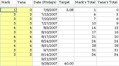
The first two columns track how many days we each rode that week (1 row per week). Each day we rode, we would manually increase the count for the current week. I made their background yellow to make it more obvious where to enter new data.
The target column shows our goal on the chart so we can see how we are doing. The last two columns calculate running totals (simply a matter of adding this weeks values to last week’s totals). I charted the last 4 columns (C1:F14) using a line chart with dots, with both Row 1 and Column C as labels.
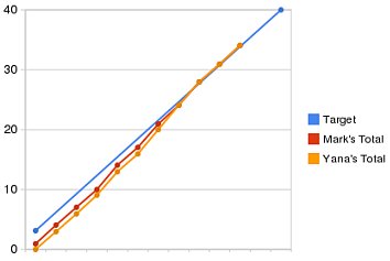
You can see that we started the quarter a little bit behind but we caught up 3 weeks ago. You can view the final spreadsheet here.
Training for a Long Hike
Last weekend, Yana and I hiked Half Dome with some friends. It’s a fairly strenuous hike: 18 miles round trip, 5000 feet of climbing at elevation. We’ve done this hike before, but this year we decided we try to semi-seriously train for it, to see if it made it easier. We started training 12 weeks before the hike with a pretty simple training plan: do a long hike on the weekends with 1 or 2 short hikes mid-week, increasing the total mileage by about 3 miles per week.
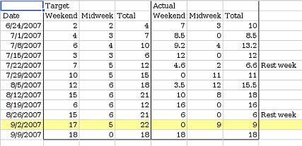
Again, I set the spreadsheet up with 1 row/week. I entered target mileages and set up an area where we could enter our actual mileages. I set up 2 charts this time: One showing our longest hike every week, and one showing our total mileage every week. Rather than trying to arrange the data I wanted to chart contiguously, I just made a 2nd sheet with formulas to rearrange the data into something more chart-friendly.
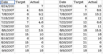
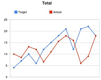
I shared this spreadsheet with our friends and updated it after every training hike (you can view it here). As you can see, we didn’t stick very closely to our training plan. It turns out hiking this much eats up a lot of time, and there were some weekends where we just couldn’t fit in a long hike. However, we still got quite a bit of training, and managed to fit a 16 mile hike in 3 weeks before Half Dome. Seeing our actual mileage so far below the target mileage provided good motivation to go for training hikes. The hike up Half Dome went really well: we were faster than last time, and had more energy at the end of the hike.